Cohort Retention Analysis
Cohort analysis is a powerful tool that allows businesses to understand how different groups of customers behave over time. By grouping customers into cohorts based on when they first started using a product or service, businesses can identify trends in customer behavior and make data-driven decisions to improve customer retention and engagement.
What is Cohort Analysis?
Cohort analysis is the process of grouping customers into cohorts based on shared characteristics, such as the time they first started, restarted or resumed a subscription, their geographic location and any other parameter available in the filters. Once these cohorts are established, businesses can analyse how customer retention changes over time, which can reveal insights into customer engagement and loyalty.
Once this data has been collected, businesses can use it to create cohort retention curves, which show how many users from each cohort remain active over time.
In this implementation we are considering the following subscription in the cohort:
- subscription that start without a trial;
- conversions or upgrades after a trial;
- subscription restarting after having previously expired;
and we follow them until they expire.
We want to calculate and visualise the user retention over time for each cohort.
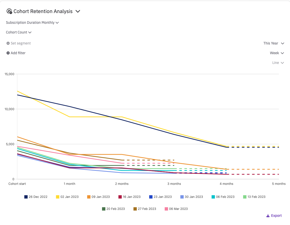
Cohort Retention Count Analysis
Cohort Retention Count Analysis allows you to define cohorts based on a time granularity of your choice (day, week, or month), as well as any relevant filters such as country or store. You need to specify the subscription type (weekly, monthly, quarterly, biannual or annual). For example, if you choose a monthly duration, the analysis will consider up to 12 months of data for each cohort. If you choose an annual duration, the analysis will consider up to 4 years of data for each cohort. Of course, it all depends on what type of subscriptions you provide to your users.
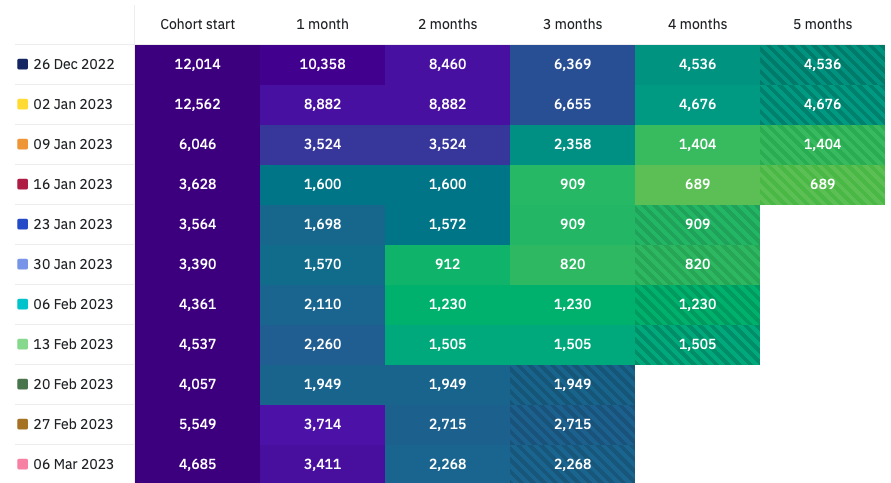
Each cohort is labeled with the first day of the related granularity, and the table displays the number of users in each cohort and the number of users retained at each subsequent subscription duration. The table cells are color-coded with a heat map that ranges from purple (when the whole cohort is retained) to yellow (when none of it is retained).
Keep in mind that the last cell of each row may have partial data because we provide information as soon as it's available, even if it may change before the period concludes. For instance, if you choose a monthly subscription duration and examine a cohort defined three weeks ago, you may already see some reduction in retention in the first month after subscription, but this number can still change for the next week and few days. To indicate this, the cell's background has a different texture.
Finally, the only available chart type for this kind of data is a line graph that shows the counts against the number of subscription durations elapsed since the first day of the cohort. Regardless of the subscription duration, the calculation is made at the daily level based on the number of days since the individual subscription started. When data is incomplete, the line is dashed to reflect this in the chart.
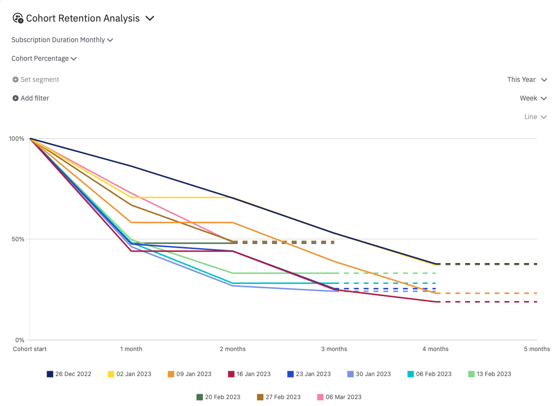
Cohort Retention Percentage Analysis
Cohort Retention Percentage Analysis follows the same approach as the Count Analysis, with one key difference: all cohorts begin with 100% retention if they have at least one user, and decline to 0% over time. This normalization enables easy comparison of retention rates across different cohorts, regardless of their size.
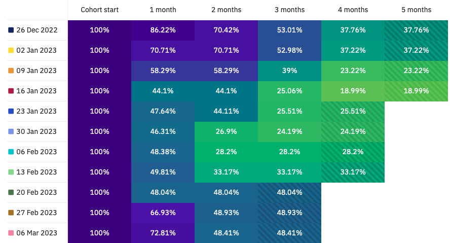
As with the Count Analysis, you can specify the granularity of the time periods defining the cohorts (e.g., day, week, month), as well as any filters you want to apply. The table format is also the same, with the percentage of users in each cohort shown in the first column (100% by definition), and subsequent columns displaying retention percentages after each subsequent subscription period. The cells are color-coded using a heat map, with shades of purple indicating higher retention rates and yellow indicating lower rates.
The chart for the Cohort Retention Percentage Analysis also shows retention rates against the number of subscription durations elapsed since the first day of the cohort, but with retention rates normalized to the size of each cohort.
Any incomplete data is represented with dashed lines in the chart and a different cell texture in the table, as in the Count Analysis.
When no users are present in a cohort, since normalisation would produce a NaN, we only show "--" on the whole line, color coded as if no subscription remain.
Updated over 1 year ago